YouTube Music’s Transformative Redesign: A Deep Dive into the Dual-Pane Revolution
In the fiercely competitive arena of digital music streaming, the struggle for user attention and loyalty is an ongoing, high-stakes battle. Dominant players like Spotify and Apple Music have meticulously carved out their niches: Spotify, with its legendary, often eerily accurate discovery algorithms that feel like a personal DJ, and Apple Music, boasting seamless integration within Apple’s vast ecosystem alongside its premium spatial audio offerings. For a considerable period, YouTube Music, despite being backed by the colossal Google, seemed to lack a definitive, compelling identity. It often felt like a powerful library without a clear guiding philosophy. However, with a significant new redesign now rolling out to users, that narrative is dramatically shifting, revealing a confident new direction for the platform.
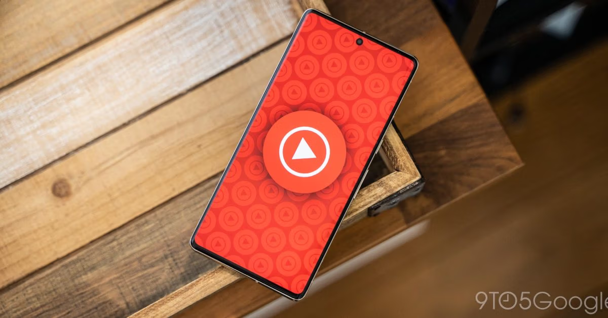
The core of this transformative update lies in the “Now Playing” screen on both Android and iOS devices, introducing what the company aptly calls a “dual-pane” interface. While the term “dual-pane” might initially conjure images of dry technical specifications, its implementation is far from mundane. It represents a remarkably clever and elegant solution that subtly but profoundly redefines the very essence of the listening experience on YouTube Music, elevating it beyond mere audio playback.

So, what exactly is the profound implication of this seemingly simple split screen? It’s a beautifully orchestrated tale of two halves, each serving a distinct yet complementary purpose, working in concert to create a richer, more engaging user journey.
The upper half of your device’s screen retains its traditional role, acting as the sacred space for the music itself. Here, the album art proudly takes center stage, accompanied by the track title, artist information, and the essential playback controls—play, pause, skip, and scrub. This area is dedicated to providing the familiar, focused, and uninterrupted listening experience that users expect from any premium music service. It’s clean, uncluttered, and allows the music to be the primary focus, maintaining a sense of traditional audio consumption.
The bottom half, however, is where YouTube Music truly begins to differentiate itself and embrace its heritage. This second, dynamic pane is now a dedicated, easily accessible, and highly interactive hub for everything *surrounding* the music. It’s the vibrant, often chaotic, but undeniably engaging world of user interaction: the comment section, synchronized lyrics for a sing-along experience, and your “Up Next” queue, ready for the next sonic adventure. This isn’t merely a repositioning of existing elements; it’s a strategic decision that elevates the community and contextual elements to be as prominent and accessible as the music itself.
This strategic move is far more than a superficial refresh or a mere rearranging of pixels for a new aesthetic. This is YouTube Music, with newfound clarity and confidence, finally and unapologetically embracing its intrinsic YouTube DNA. It’s a bold declaration of intent, signaling that the platform understands its unique strengths and is prepared to lean into them fully to carve out a distinctive identity in a saturated market.
The Takeaway: Embracing Community and Interaction, Not Just Curation
For many years, YouTube Music struggled with its identity, often feeling like a conventional music streaming application that simply happened to possess an unparalleled connection to YouTube’s gargantuan video and audio catalog. The vital elements of community and interaction—the very beating heart and soul of the main YouTube platform—were indeed present, but they were largely relegated to the background. Tucked away behind multiple taps, scrolls, and sub-menus, accessing comments or lyrics often required users to pull themselves away from the core listening experience, disrupting the flow and making interaction feel like an afterthought rather than an integral part of the journey.
This innovative dual-pane design fundamentally alters that dynamic. It decisively elevates the social layer, transforming it into a first-class citizen, presented on equal footing and with similar prominence alongside the music itself. The implications are profound: now, you can immerse yourself in a track while simultaneously scrolling through a dynamic feed of thousands of other listeners’ thoughts, reactions, and insights. You can follow along with synchronized lyrics, perfect for karaoke or deeper understanding, without ever losing sight of the album art or the essential playback controls. This design choice transforms what was often a passive, solitary listening activity into an active, shared, and deeply engaging experience, fostering a sense of connection that other platforms struggle to replicate.
This strategic move grants YouTube Music a significant, almost insurmountable, competitive advantage—a differentiator that Spotify and Apple Music, by their very nature, simply cannot replicate. They lack the established, decades-old, incredibly vibrant, and sometimes wonderfully chaotic comment ecosystem that is uniquely YouTube’s. This rich, user-generated content, encompassing everything from heartfelt praise to humorous observations, deep analysis, and shared nostalgia, is an invaluable asset. By cleverly splitting the screen, Google is effectively splitting its focus: one half is meticulously dedicated to the pristine delivery of music, while the other is dedicated to fostering and celebrating the community around that music. It’s a brilliant, elegant, and highly effective way to leverage its single greatest differentiator, turning a potential weakness (its YouTube origins) into its most formidable strength in the music streaming wars.
Fostering Deeper Engagement Through Shared Experience
The power of the dual-pane extends beyond mere accessibility. It taps into fundamental human desires for connection and shared experience. When a listener encounters a particularly moving lyric or a powerful instrumental break, the immediate availability of a comment section allows for instant gratification of that urge to react and connect. Users can see if others felt the same way, discover new interpretations, or simply revel in the collective appreciation of a musical moment. This creates a feedback loop that enhances emotional resonance and makes the music feel more alive and collaborative. Moreover, for emerging artists or niche genres, this immediate community engagement can be invaluable, fostering a loyal fanbase and providing direct feedback in a way that traditional streaming platforms often fail to achieve.
What This Means for the Future of YouTube Music and Interactive Listening
This redesign is far more than a superficial update; it is a clear and unequivocal statement of intent from YouTube Music. The platform is no longer content to merely compete on foundational metrics like catalog size, audio quality, or the meticulously curated quality of its playlists—though these remain important. Instead, it is decisively shifting its competitive battleground to the realm of *interaction* and *community engagement*. This redefines the very definition of a “music streaming service” in the modern age, suggesting that the future isn’t just about what you hear, but how you experience it in relation to others.
The potential for this second pane to evolve and become even more dynamic is truly exciting and vast. We can easily envision a future where this dedicated interaction space becomes a canvas for a multitude of immersive experiences. Imagine the thrill of live artist Q&As seamlessly integrated during a song premiere, allowing fans to submit questions and receive real-time answers without ever leaving the Now Playing screen. Picture behind-the-scenes facts, trivia, or production notes popping up at key moments within a track, offering a deeper understanding of the music’s creation. Or consider a seamless toggle to the official music video, or even fan-made visualizers, without interrupting the audio stream or navigating away from the core interface. This opens the door for a truly multimedia-rich music experience, a convergence of audio, video, and community that no other major platform is currently positioned to offer with such native fluidity.
Future Innovations: Beyond Comments and Lyrics
The possibilities for the interactive pane are virtually limitless. We could see integrated polls and quizzes related to artists or songs, direct links to merchandise stores related to the currently playing track, or even real-time concert information based on your location. The space could be utilized for fan art showcases, allowing listeners to submit and view visual interpretations of music. Imagine educational content about musical theory or cultural context appearing for classical or world music tracks. For podcasters or creators, this dual-pane could revolutionize how listeners interact with spoken-word content, perhaps displaying footnotes, supplementary links, or even live chat discussions during an episode. The current iteration is merely the beginning of what could become a highly personalized and deeply interactive content hub, making every listening session a discovery journey.
By intelligently and intentionally creating such a clear and dedicated space for both passive listening and active interaction, YouTube Music is not merely updating its interface; it is forging a unique, compelling, and deeply resonant identity for itself in an increasingly crowded and undifferentiated market. It’s a strategic bet—and one with significant potential—that the future of music streaming isn’t just about the vast catalog of songs you have access to, but rather about the richness of the experience, the depth of connection, and, ultimately, who you listen with. This fundamental shift positions YouTube Music not just as a competitor, but as a pioneer in the evolving landscape of digital music consumption, where community and context are elevated to the same importance as the audio itself.
Read the original story at 9to5google.com.
What are your thoughts on this new dual-pane design from YouTube Music? Do you think focusing on community and interaction is the key to winning the streaming war, or do you prefer a more traditional, music-focused experience?