Beyond Flat: Apple’s ‘Liquid Glass’ Isn’t Just a Redesign—It’s a Revolution
For over a decade, the iPhone in your pocket has operated under a consistent design philosophy. Since iOS 7 famously shed the leather stitching and felt textures of its early years, we’ve lived in the era of “flat design.” It’s been clean, functional, and familiar. But according to a new report, that familiarity is about to be shattered.
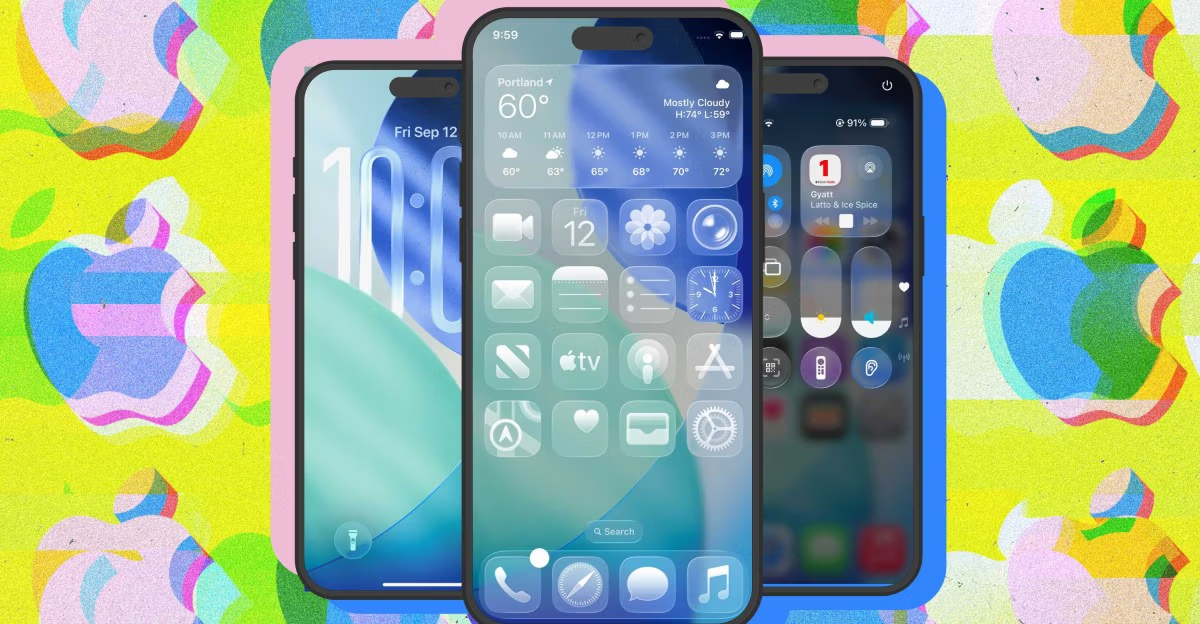
Apple is reportedly gearing up for its most significant user interface overhaul in a generation with iOS 26, and the new design language has a name that’s as intriguing as it is evocative: “Liquid Glass.”

If you’re picturing a return to the glossy, skeuomorphic buttons of 2012, think again. This isn’t a step backward. It’s a calculated leap into a new dimension of interface design, and it tells us more about Apple’s future than you might think.
The Big Picture: More Than a Fresh Coat of Paint
The “Liquid Glass” aesthetic, as described, moves away from the opaque, layered cards we see today. Instead, it leans into translucency, depth, and light. Imagine UI elements that don’t just sit on top of your wallpaper, but seem to float above it, subtly refracting the colors behind them like frosted panes of glass. Think of notifications that don’t just slide in, but shimmer into existence, catching virtual light as they move.
This is a profound shift. The flat design era was about clarity and simplicity, stripping away ornamentation to focus on content. “Liquid Glass” suggests a future where the interface itself is an experience—dynamic, responsive, and deeply integrated with the hardware’s power. Rendering these kinds of complex, light-aware effects in real-time across an entire operating system isn’t easy. It signals that Apple is confident its future A-series chips will have graphical horsepower to spare, making the OS itself a showcase of that power.
The Real Story: A Bridge to Spatial Computing
But why now? The answer likely has less to do with the iPhone and more to do with what comes next. Look no further than the Apple Vision Pro.
The entire interface of visionOS is built on this very concept: windows made of glass, soft light, and a sense of physical depth. It’s a “spatial” operating system. By bringing a similar “Liquid Glass” design language to the iPhone, Apple is building a crucial bridge between the 2D device in our hands and the 3D world of spatial computing.
This isn’t just about making things look consistent. It’s about acclimating hundreds of millions of users to a new way of interacting with digital objects. When your iPhone’s interface subtly mimics the physics of light and transparency, your brain is already being trained for an environment where those rules are paramount. It makes the eventual transition from phone to headset feel less like a jump and more like a natural step.
iOS 26’s redesign, then, isn’t just for the iPhone. It’s the foundational aesthetic for Apple’s next decade, an era where the boundaries between our devices continue to blur. It’s a sign that the company is no longer designing for a single screen, but for a continuous, multi-dimensional ecosystem.
The flat era brought us clarity and focus. This next chapter, built on the principles of “Liquid Glass,” is poised to bring us a world of depth, immersion, and a hint of magic. Your iPhone is about to look different, yes, but more importantly, it’s about to feel like the future.
Read the original story at The Verge.
What do you think of this rumored “Liquid Glass” redesign? Are you ready for a more dynamic and immersive iPhone experience, or do you prefer the clarity of flat design?