More Than a Letter: Decoding Google’s Ubiquitous New ‘G’ and What It Means
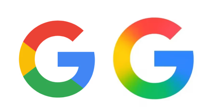
You might have noticed it. A subtle shift, perhaps. The familiar single-color blue ‘g’ that once adorned your Google search bar or app icon is progressively fading into history, replaced by a vibrant, four-color gradient ‘G’. On the surface, it’s just a logo update. But beneath this seemingly minor cosmetic tweak lies a strategic move by Google that speaks volumes about its evolving identity and its vision for the future, signaling a deeper integration into our daily digital lives and a renewed focus on brand consistency.
This isn’t just about a fresh coat of paint; it’s the culmination of a much larger rebrand effort Google initiated years ago, aiming to modernize its visual language and project an image that resonates with its multifaceted product ecosystem. The rollout of this new, colorful ‘G’ across virtually every Google product – from Search to Maps to News, and even into hardware like Pixel phones and Nest devices – isn’t merely an aesthetic choice. It’s a declaration of ubiquitous consistency, a quiet but powerful reinforcement of Google’s pervasive presence and its commitment to a unified user experience across an ever-expanding array of services.

In an age where brand recognition is paramount, and digital touchpoints are multiplying exponentially, a cohesive visual identity becomes an invaluable asset. Google’s transition to this unified ‘G’ is a testament to the meticulous planning and strategic foresight involved in managing one of the world’s most influential brands. It’s designed to be instantly recognizable, regardless of context or screen size, ensuring that every interaction, no matter how brief, feels unmistakably “Google.” This strategic evolution underscores Google’s commitment to maintaining a clear and approachable identity as it continues to innovate and expand its technological footprint.
The Power of a Single Letter: Unpacking Google’s Brand Consistency
Think about the sheer volume of touchpoints where you encounter Google daily. It’s not just the search engine homepage anymore; it’s your phone’s operating system (Android), your email (Gmail), your smart speaker (Google Home/Nest), your navigation (Google Maps), your productivity suite (Google Workspace), and countless other applications and services. In this expansive and increasingly interconnected ecosystem, a single, consistent visual identifier becomes incredibly potent. The ‘G’ is Google’s shorthand, its most compact ambassador, carrying the weight of its brand legacy and future aspirations into every digital corner.
Making this ‘G’ unified and instantly recognizable across disparate services ensures a seamless and intuitive brand experience, no matter where or how you interact with the company. This consistency reduces cognitive load for users, fostering a sense of familiarity and trust. When you see that vibrant ‘G’, you implicitly understand the underlying intelligence and helpfulness that Google strives to provide, whether it’s powering a search query, facilitating a video call, or executing a smart home command. This visual anchor helps users navigate Google’s vast digital landscape with ease and confidence, reinforcing a feeling of a trusted, omnipresent assistant.
The choice of a four-color gradient isn’t accidental either; it’s a deliberate design decision rich with symbolism and strategic intent. It mirrors the full Google logo’s vibrant palette, bringing a sense of warmth, dynamism, and approachability. This visual choice reflects Google’s strategic pivot from a purely utilitarian search company to a more human-centric AI and services provider, emphasizing connection and engagement over mere function. The colors themselves — blue, red, yellow, and green — are iconic and have been associated with Google for decades, evoking a sense of heritage while the gradient application introduces a modern, digital-first sensibility. It’s a subtle nod to the interconnectedness of their products and the diverse ways they aim to enhance our lives, representing the spectrum of information and services Google now offers across various platforms and devices.
Furthermore, the design of the ‘G’ itself, with its simple, geometric sans-serif style, is optimized for digital environments. It maintains clarity and impact even at minuscule sizes, crucial for app icons, favicons, and subtle UI elements. This isn’t merely about aesthetics; it’s about functionality and ensuring that the brand remains legible and present in every corner of the digital experience, from a watch face to an in-car display. The bold simplicity of the character ensures immediate recognition, a critical factor in a world saturated with visual information.
What This Means for the Future: Google’s Evolving Strategic Vision
This unified ‘G’ signals several key strategic directions for Google, highlighting its unwavering commitment to a future defined by integrated experiences, pervasive intelligence, and an ever-present yet subtle digital identity:
A Cohesive Ecosystem: Seamless Integration Across Devices and Services
As Google deepens its integration across hardware and software – from Android to Chrome OS, from Pixel devices to Nest smart home products, and from Wear OS to Android Auto – a consistent visual thread becomes absolutely crucial for brand recognition and user experience. This unified ‘G’ provides that thread, making every interaction feel distinctly “Google” and part of a larger, smarter whole. For users, this translates into a more intuitive, less fragmented, and ultimately more powerful experience. Imagine moving from asking your Google Assistant a question on your phone, to seeing relevant information pop up on your Nest Hub, and then receiving personalized directions via Google Maps in your car – the consistent ‘G’ subtly reinforces that it’s all part of the same intelligent, helpful system.
This visual cohesion is vital for Google to maintain its brand integrity and user trust as it expands into ever more diverse product categories. It tells a story of unity, intelligent design, and a future where Google’s services work together harmoniously to simplify and enhance daily life, creating a truly interconnected digital experience.
Brand Adaptability: Designed for a Multi-Screen, Multi-Interface World
In a world increasingly defined by diverse screen sizes, ambient computing environments, and voice interfaces, a logo needs to be incredibly versatile and resilient. The new ‘G’ is designed to be legible and impactful even at minuscule sizes – think of a smartwatch display, a favicon in a browser tab, or a small icon within a mobile app – and across a myriad of digital surfaces, from a large smart home display to a tiny notification on a wearable. Its bold simplicity ensures it can scale and adapt without losing its distinctiveness or recognizability. This adaptability is not just about looking good; it’s about ensuring that the Google brand remains a clear and accessible identifier in every potential interaction point, regardless of technological constraints.
Traditional logos often struggle with this kind of extreme scalability and maintain brand impact. Google’s ‘G’ is a masterclass in modern digital branding, prioritizing clarity and immediate impact across an unparalleled range of devices and digital contexts. It speaks to Google’s understanding that effective branding in the 21st century is about flexibility, presence, and instant recognition, rather than merely static representation.
The “Ambient” Google Identity: A Friendly Presence in the Background
We’re moving rapidly towards an era where technology fades into the background, becoming ever-present yet less obtrusive – the concept of “ambient computing.” In this future, devices and services anticipate our needs and provide assistance seamlessly without explicit commands. This new ‘G’ helps Google maintain a clear, friendly, and recognizable presence in this “ambient” future. It’s a reassuring visual cue that the intelligence powering your device or service is the familiar, helpful Google, without requiring a full logo or explicit branding text. Whether it’s a small icon on a smart thermostat, a visual indicator on an augmented reality interface, or a subtle animation on a smart speaker, the colorful ‘G’ signifies helpfulness and intelligence without demanding overt attention.
This approach allows Google to be omnipresent without being overwhelming, aligning perfectly with the philosophy of technology seamlessly integrating into the environment. It’s a gentle yet powerful reminder of the sophisticated AI working quietly behind the scenes to assist you, making your interactions with technology more natural, intuitive, and less about managing devices, and more about living life.
Reinforcing Strategic Vision: Beyond Search, Towards Pervasive Utility
Google’s ambition isn’t just about indexing information anymore; it’s about organizing the world’s information and making it universally accessible and useful through advanced AI and machine learning. This colorful, integrated ‘G’ visually communicates that expanded vision – a friendly, intelligent layer empowering everything around us. It represents Google’s evolution from a search engine company to a comprehensive AI company that provides intelligence and utility across various facets of life. The vibrant colors convey innovation, progress, and the dynamic nature of information, while the clean design suggests efficiency, clarity, and approachability.
The ‘G’ therefore becomes a symbol not just of a company, but of a promise: a promise of intelligent assistance, seamless connectivity, and a future where technology works effortlessly for you. It visually encapsulates Google’s overarching mission to make the world’s information useful, transforming it into actionable insights and helpful experiences for billions globally, thus solidifying its role as a central pillar of the digital age.
Ultimately, while many might see this as just another logo refresh, it’s far more profound. It’s Google’s visual testament to its strategic direction: a unified, approachable, and omnipresent intelligence woven into the fabric of our daily lives. The ‘G’ isn’t just a letter; it’s the signature of an evolving giant, a subtle yet powerful declaration of its pervasive influence and its commitment to shaping the future of digital interaction.
Read the original story at The Verge.
What are your thoughts on Google’s new ‘G’ logo? Do you think it effectively communicates their evolving identity, or is it just a cosmetic change in your eyes?