The Unseen Battles of Branding: What Microsoft’s Rejected Icons Tell Us About Design’s Future
We interact with them daily, often without a second thought. Those little squares and rectangles that represent Word, Excel, PowerPoint – they’re the ubiquitous signposts of our digital productivity, ingrained in our muscle memory. For billions across the globe, these icons are more than just visual cues; they are the gateway to their work, their creativity, and their connection to the digital world. Their design is a silent language, promising functionality and familiarity in a rapidly evolving technological landscape.
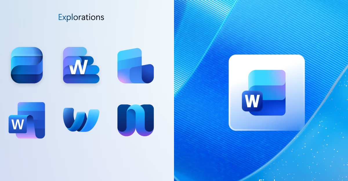
But what if they looked radically different? What if Microsoft, in a bid for innovation, had swung for the fences and given us icons that were almost unrecognizable? A fascinating peek behind the curtain recently surfaced, revealing a trove of rejected Microsoft Office icons. These weren’t just minor tweaks; some were audacious, abstract re-imaginings of the familiar. Think highly stylized, almost minimalist shapes that bore little resemblance to the papers, spreadsheets, and presentation screens we’ve grown accustomed to. This bold exploration by Microsoft’s design teams highlights the constant tension between pushing creative boundaries and maintaining established user trust.
And in their rejection lies a profound insight into the delicate dance between innovation, brand identity, and user experience. It’s a testament to the fact that even for a company as large and influential as Microsoft, design decisions are not made in a vacuum; they are a careful balance of aesthetic ambition, user psychology, and strategic business imperatives. These unseen battles of branding shape our digital interactions in ways we rarely consider.
The Peril of Pure Abstraction in Interface Design
The designs showcased in the leaked concepts were, in many cases, a radical departure from the established visual language of Microsoft Office. We saw iterations that pushed abstraction to its limits, stripping away nearly all literal representation of documents, tables, or slides. While aesthetically interesting and perhaps even beautiful in isolation, it’s easy to see why they never saw the light of day in a product used by an estimated 1.2 billion people globally. Imagine scanning your desktop, your taskbar, or your file explorer, trying to quickly launch a document under deadline pressure, and being met with a sea of unfamiliar, highly stylized glyphs. The instant recognition, the almost subconscious muscle memory built over decades of interaction with these tools, would be utterly shattered. This increase in cognitive load, even for a split second, translates into wasted time and user frustration on a massive scale.
This episode underscores a critical tension inherent in modern interface design: the constant desire to modernize, streamline, and innovate versus the imperative of immediate usability and brand consistency. Icons are far more than just pretty pictures; they are crucial cognitive shortcuts. They embody the promise of the software they represent, acting as compact brand ambassadors that trigger instant recognition and expectation. For a suite as deeply embedded in global workflows and education as Microsoft Office, disrupting that established visual language isn’t just a stylistic choice; it’s a potential business risk of monumental proportions. Users rely on these tools for mission-critical tasks, and any perceived barrier to entry or slowdown in their workflow can have significant repercussions, from decreased productivity to a migration to competing platforms. The rejected icons likely fell victim to the fundamental need for recognition and intuition – a principle that unequivocally trumps pure aesthetic novelty when billions of users are involved and productivity is paramount.
Maintaining a delicate balance between refreshing a brand’s visual identity and preserving the familiarity that users depend on is a cornerstone of successful product design, especially for mature products. A complete overhaul, however visually striking, can inadvertently alienate a loyal user base, leading to confusion and resistance. For productivity tools, where efficiency and ease of use are paramount, any design choice that hinders quick identification or forces users to re-learn basic visual cues poses a significant threat to user experience and, ultimately, market share. The abstract designs, while perhaps signaling innovation, failed to communicate the core function of the applications instantly, a non-negotiable requirement for software of this magnitude.
What This Means for the Future of Design and Branding
This fascinating glimpse into Microsoft’s design graveyard offers invaluable lessons for how we approach digital interfaces, branding strategies, and user experience going forward. It’s a reminder that even the most ambitious creative endeavors must be grounded in real-world user needs and established brand equity.
The Enduring Power of Familiarity in Digital Interfaces
While tech companies are often lauded for disruption and groundbreaking innovation, this story powerfully reminds us that familiarity holds immense, often underestimated, value, especially for core productivity tools. For applications like Word or Excel, which have permeated nearly every professional and educational environment globally, evolution almost always triumphs over revolution. Users build deep-seated mental models around these tools, and abrupt changes can be disorienting and counterproductive. Future design efforts will continue to grapple with the delicate art of how to update and refresh a digital product’s aesthetic without alienating a massive, accustomed user base. It’s about careful, iterative design, not reckless reinvention. Consider the successful design updates seen in operating systems like iOS or Android; while they introduce new aesthetics and functionalities, the core visual cues and navigation patterns often evolve rather than drastically change, ensuring a smoother transition for users.
Brand Identity is More Than a Logo or a Single Icon
An icon isn’t just a splash of color or a unique shape; it’s a miniature brand ambassador, a critical component of a much larger brand identity. Microsoft’s decision to reject these abstract icons highlights that their established visual language for Office is a fundamental, almost sacred, part of its overarching brand identity. This visual continuity reinforces user trust and positions the product suite as reliable and professional. Designers today must think beyond isolated elements, understanding how every visual cue – from the color palette to the typography, and critically, the application icons – contributes to a holistic brand experience and reinforces user trust. A consistent and recognizable visual identity builds equity over time, making a product feel dependable and familiar, which is particularly vital in competitive markets where users have numerous alternatives. The Office icons, with their distinct colors and symbolic representations, have become synonymous with productivity and professionalism worldwide, and any radical departure risks diluting that powerful brand association.
The Invisible Work of Design Refinement and User-Centric Iteration
We rarely see the hundreds or thousands of concepts that are meticulously developed, tested, and ultimately discarded for every successful design that makes it to market. This peek into Microsoft’s process emphasizes the vast amount of iterative work, internal user testing, strategic decision-making, and often difficult rejections that go into seemingly simple elements like an application icon. Good design isn’t accidental or solely the result of a single stroke of genius; it’s the product of rigorous research, extensive feedback loops, and relentless refinement. It underscores the importance of a user-centric design approach where every decision, no matter how small, is weighed against its potential impact on the end-user’s experience. This behind-the-scenes effort ensures that what eventually reaches the public is not just aesthetically pleasing, but supremely functional and intuitive, reflecting countless hours of careful consideration and problem-solving.
Finding the Balance in Modern Minimalism for Clarity and Function
The global trend towards minimalist design continues to influence digital interfaces, promising cleaner, less cluttered user experiences. However, this case study warns against taking minimalism too far, too fast, especially when it compromises core usability. While clean and uncluttered aesthetics are often desirable, they should never come at the expense of clarity and function. The future of interface design lies in a sophisticated minimalism that communicates instantly and intuitively, rather than a bare abstraction that demands deciphering and causes cognitive friction. True minimalist design achieves simplicity by distilling elements to their essential form while retaining immediate recognition and meaning. It’s about removing unnecessary noise without sacrificing crucial visual cues. The challenge for designers will be to strike this delicate balance, creating interfaces that are elegant and modern, yet remain instantly understandable and highly functional for diverse global audiences. Overly abstract icons, by definition, fail this crucial test of immediate comprehension.
Ultimately, the story of Microsoft’s rejected Office icons isn’t just about what could have been or a missed opportunity for radical aesthetics. It’s a powerful testament to the complex, user-centric process behind every digital experience we take for granted. It’s a profound reminder that sometimes, the most insightful and impactful design decisions are those that happen behind closed doors, protecting us from a future where our most essential tools become a little less familiar, a little less intuitive, and significantly less efficient. It reinforces the notion that effective branding and user experience are deeply intertwined, requiring a constant dialogue between innovation and the enduring power of what works.
Read the original story at The Verge.
What are your thoughts on the tension between design innovation and user familiarity? How much change can users truly tolerate before a product becomes unrecognizable or frustrating?